- Published on
New homepage design for API Waktu Solat
Few days ago, while I was browsing the API Waktu Solat website, I suddenly had this thought to myself, "Wouldn't hurt for a bit of a visual refresh, would it?" The website looks the same after several years. To keep it fresh, I decided to give the homepage a new look, but I wasn't sure about the design direction yet.
So I browsed through Dribbble for some inspiration, there are a few that caught my attention, but every one of them I had minor complaint about. Example: "This looks a bit messy", "This looks AI generated", "This feels bla bla bla...". I couldn't find a suitable candidate for an API server homepage.
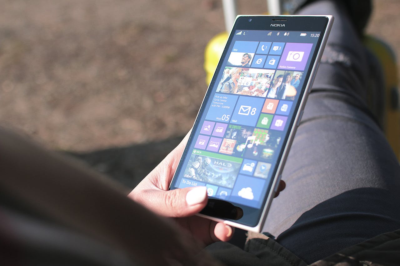
After a few minutes contemplating, I remembered that I really like old Windows Phone UI. The design had a special place in my heart even though I never own the device. I once dreamed to have a Lumia phone. The UI is so ahead of its time, I would say, and others agreed too. So I decided to take inspiration from that design language.
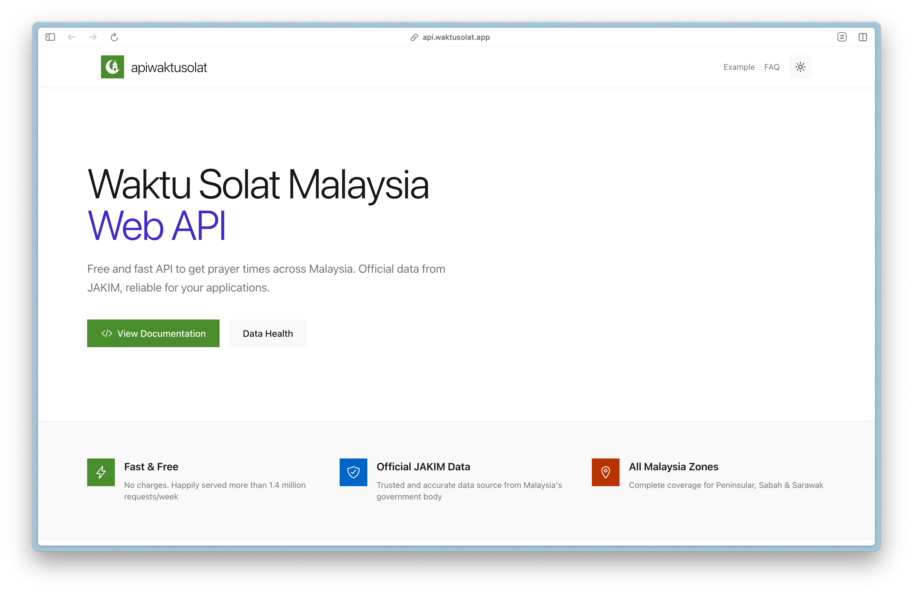
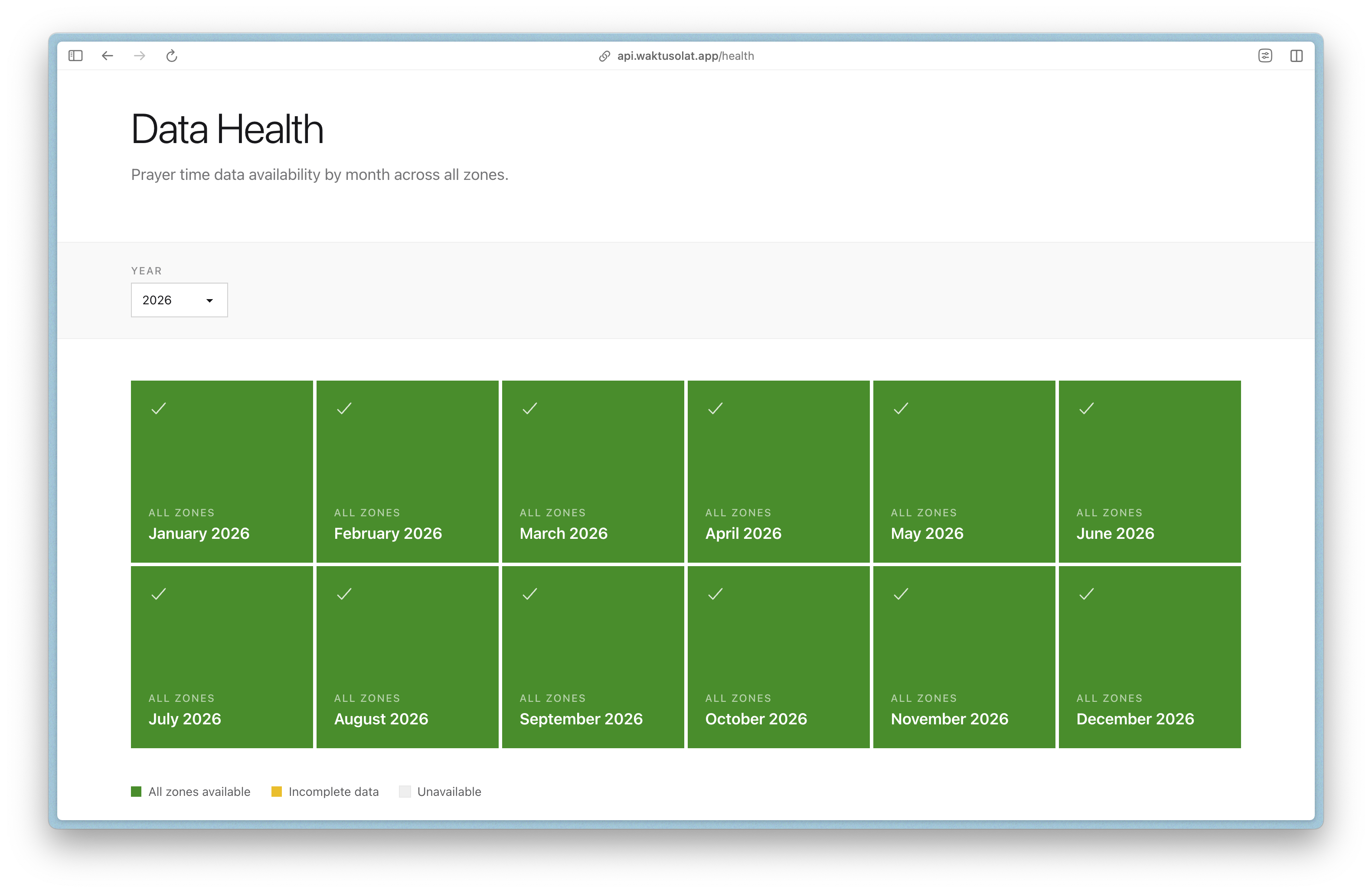
I asked v0 to create a mockup using this aesthetic. It did nicely and I tweaked a bit here and there in the final version. Here is the result of the redesign, I hope you like it.
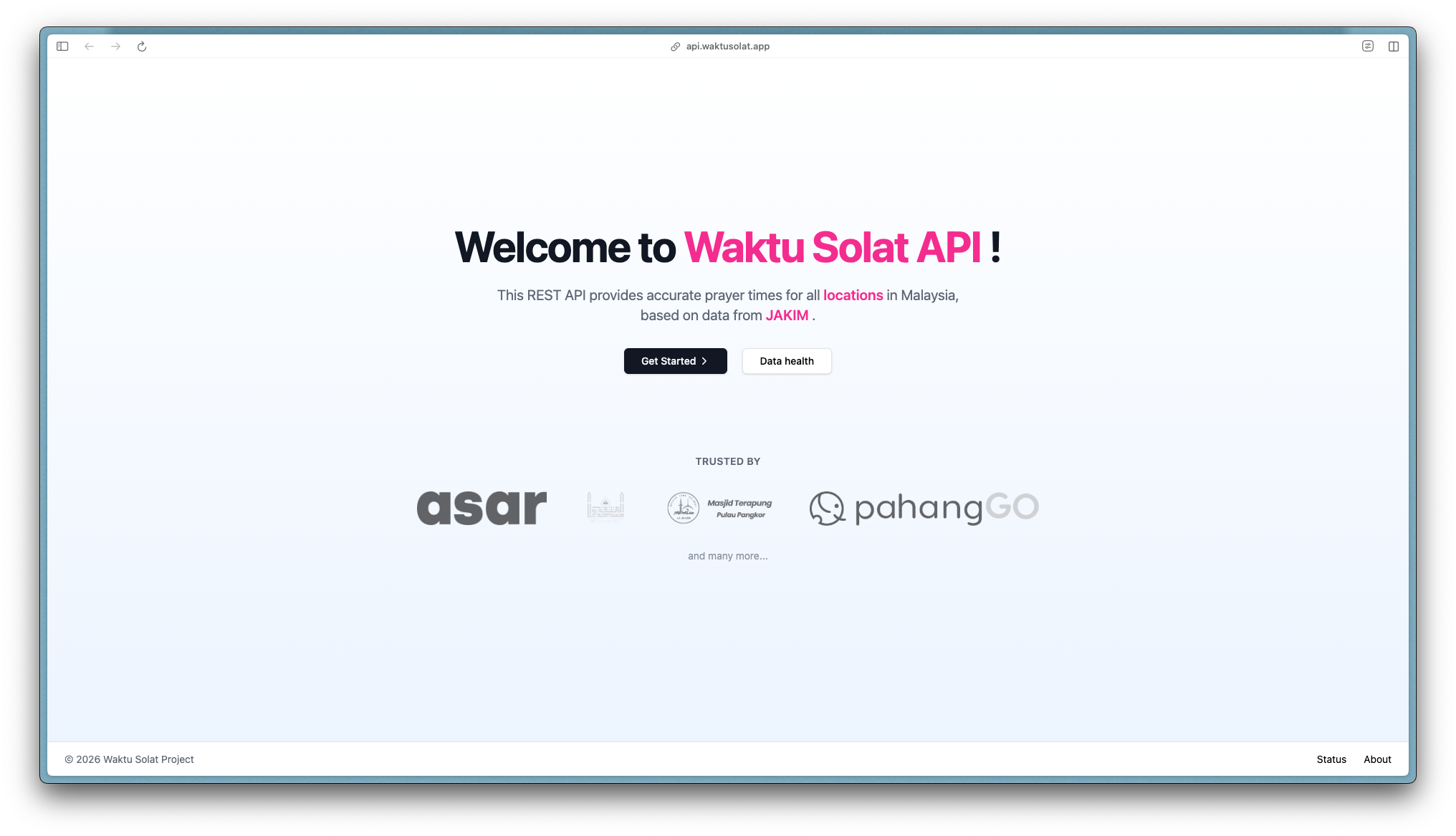
To recap, this is the old homepage screen that I had since 2023:
References: